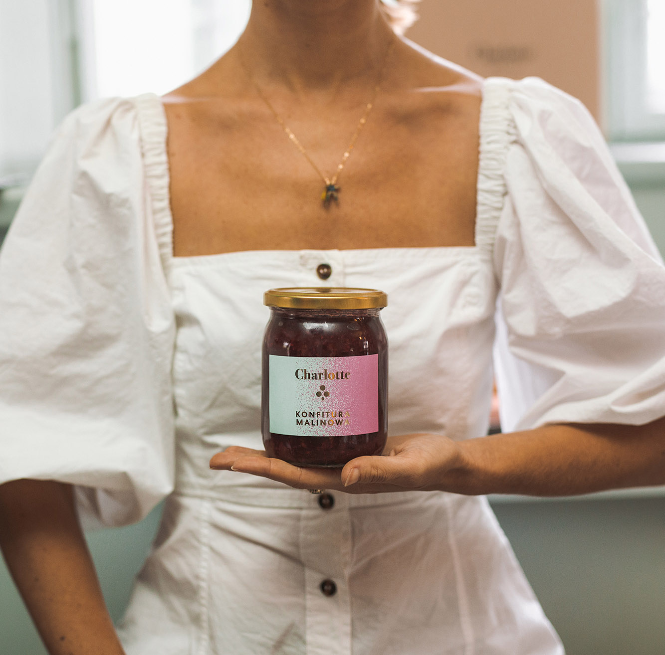
Charlotte is a bistro and cafe gone brand that is located in Warsaw, Poland and was founded in 2011. They opened up their very first location at the famous square Plac Zbawiciela and instantly grew to become one of the hit spots and go to places in Warsaw. Within just a couple of years the amount of cafes expanded to 5 locations. Charlotte is famous for their breakfasts, where they present a variation of home made jams and chocolate spreads.
Throughout their 9 years of existence and after understanding that they created a brand, they used the same type of visual identity that derived from the color of their menu and website, a light sky blue. They soon realized that this was not meeting their brand needs. With the expansion and high positioning in the Polish food scene the demand for their products outside of their cafes grew even stronger, they had already started to produce honey, assorted teas along with their existing jams and assorted spreads. The question now was how were they going to represent their brands in the home of the consumers and make this side of their business even more attractive. With their latest cafe expansion at the famous square Plac Trech Krzyży in Warsaw they invited us for breakfast to talk about how we could help them create a new long lasting brand identity that could represent them and their products in the same traditional way but with a touch of self made innovation in package and label design.
In our work for Charlotte the main task was to create a label design that is presented on closed jars with their homemade specialties inside. Using a palette based approach we developed a collection of 8 label designs for Charlotte's home made products. The gradient found on the label design represented by the light blue sky flagship colour maintained the originality of the brand and paved the way for a whole new colour palette. We wanted the design to have an elegant finishing touch so we used the method of hot stamping, which emphasized the gradient, shed light on the new colour palette and gave the product its own character.
We created and designed 35 labels and they found themselves on the products and in the shelves of all Charlotte locations in March 2020 as well as in their online shops. They also created a visual and tasty buzz in Instagram stories and posts.
We created and designed 35 labels and they found themselves on the products and in the shelves of all Charlotte locations in March 2020 as well as in their online shops. They also created a visual and tasty buzz in Instagram stories and posts.


