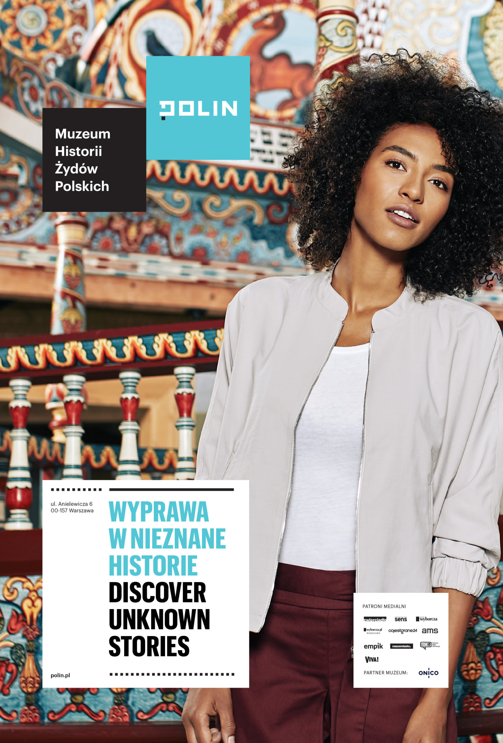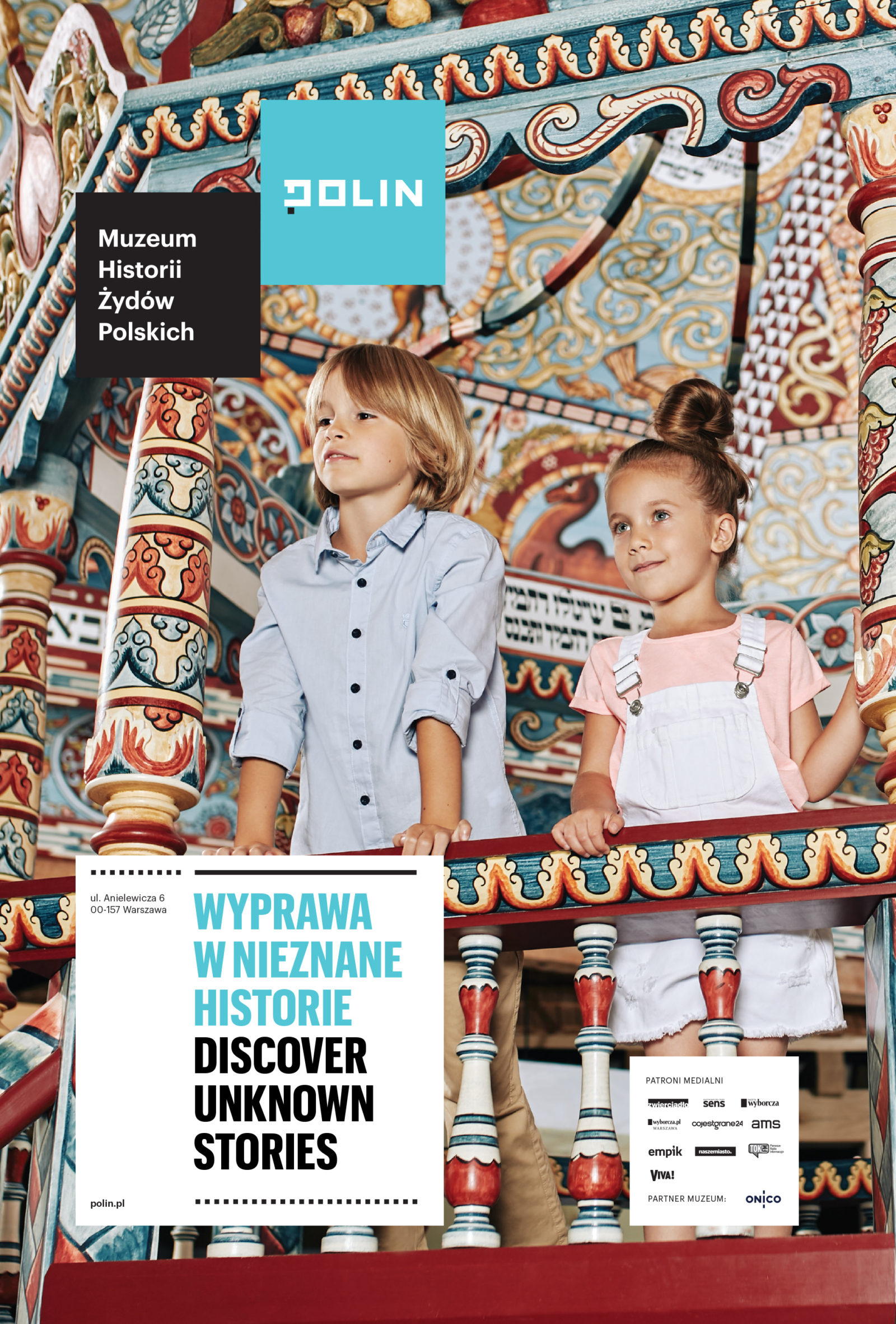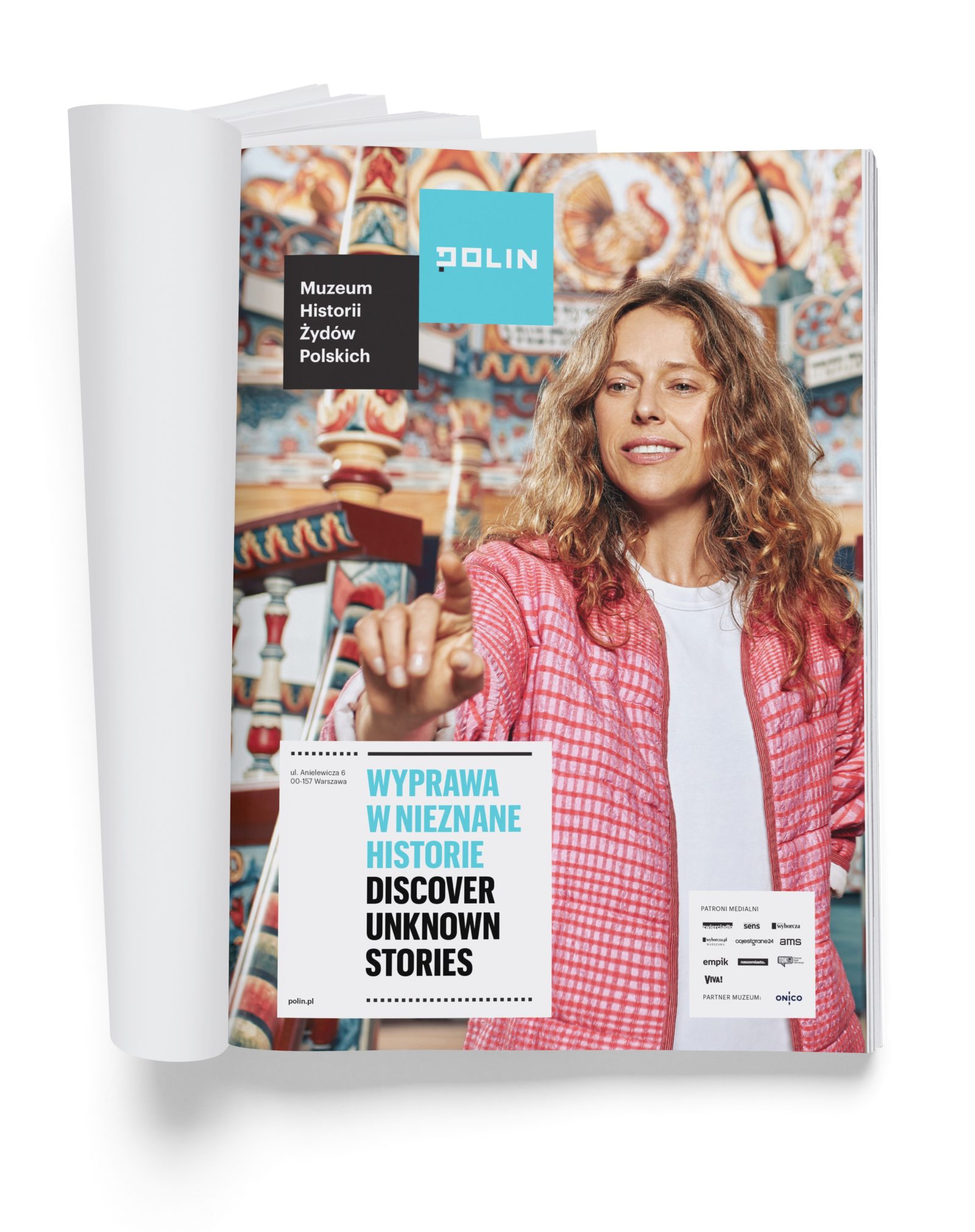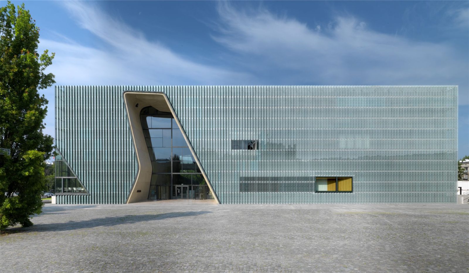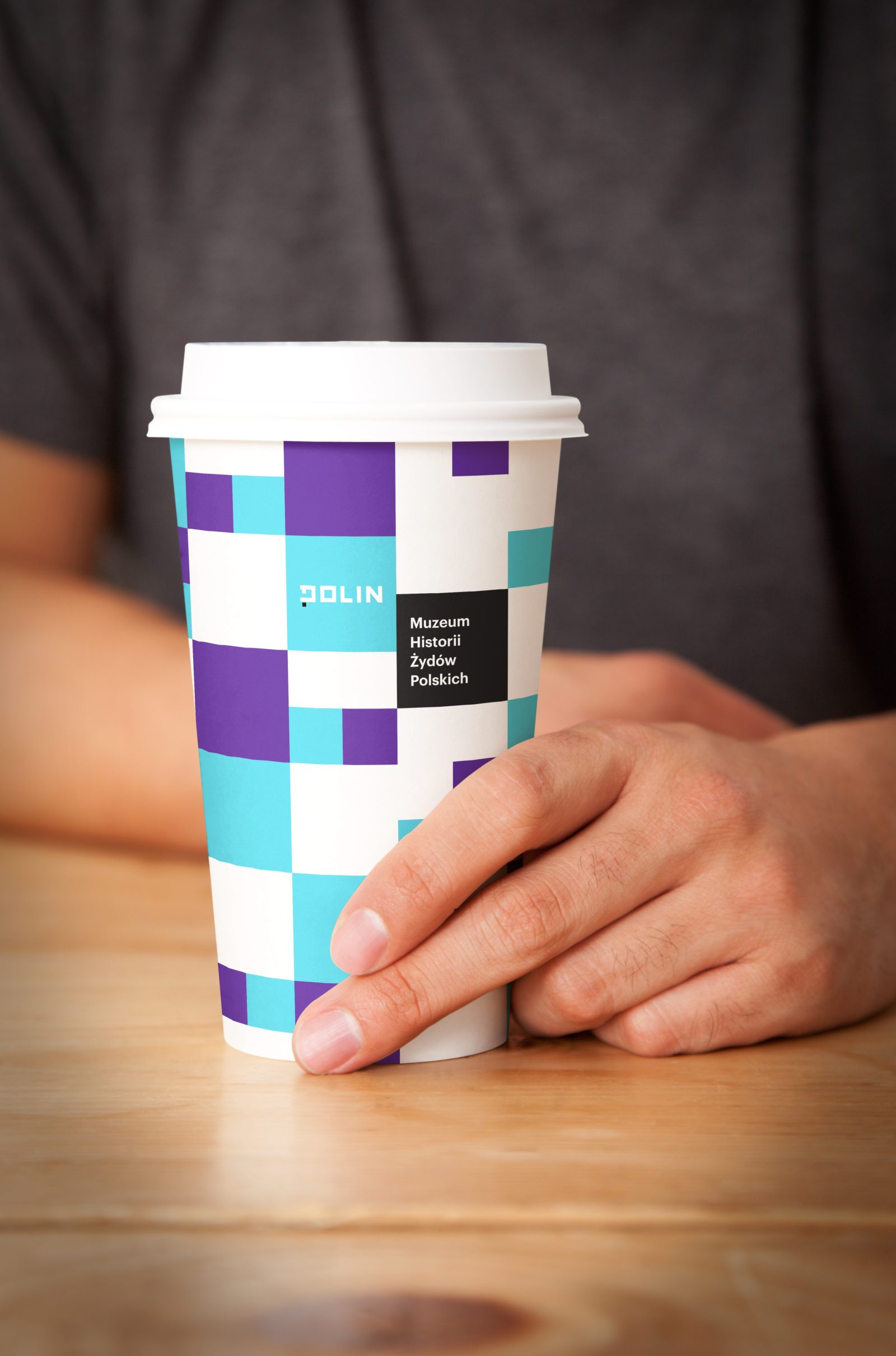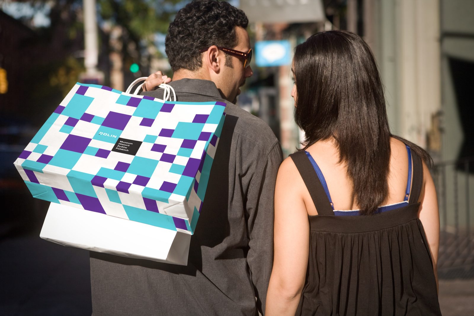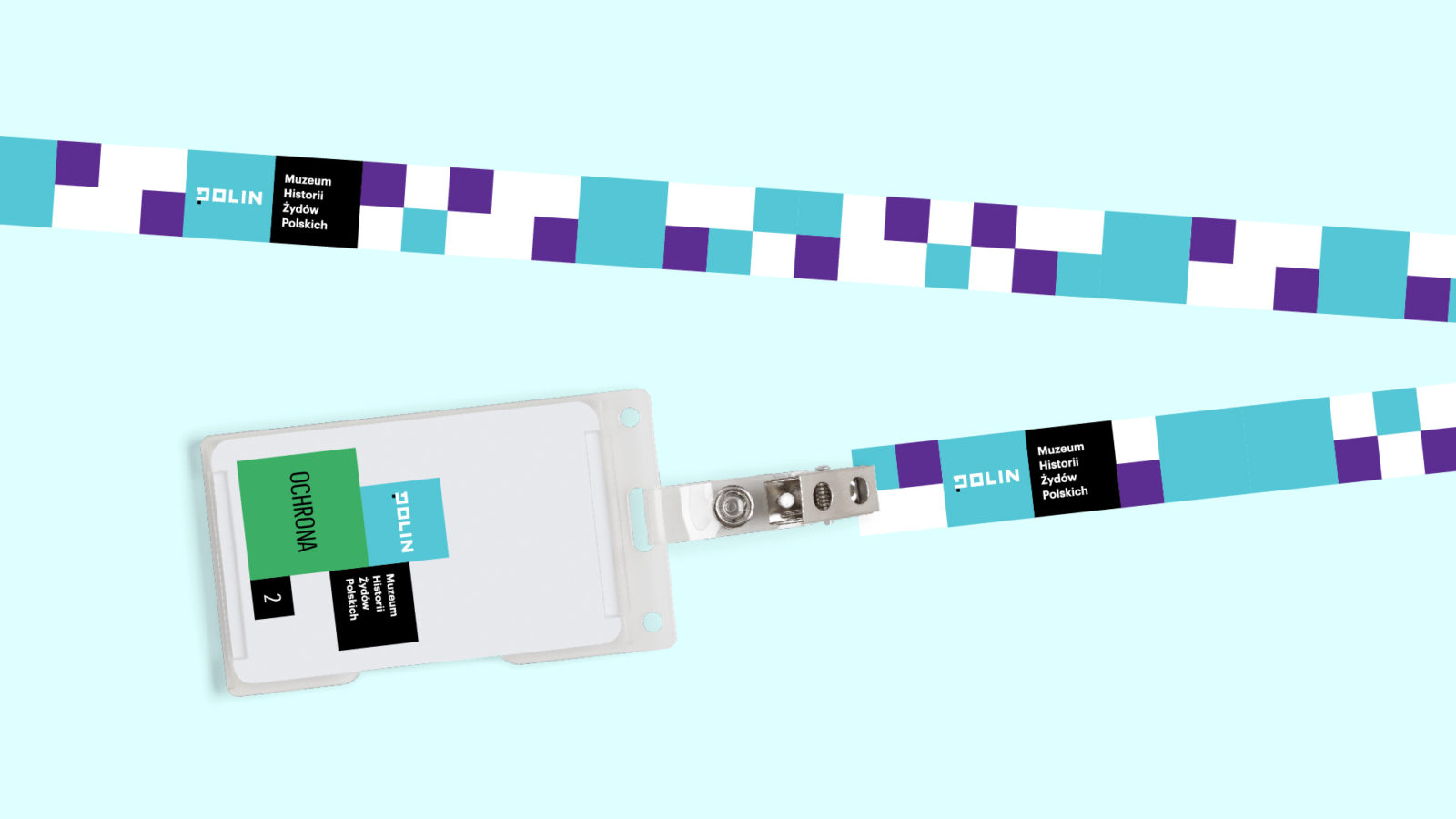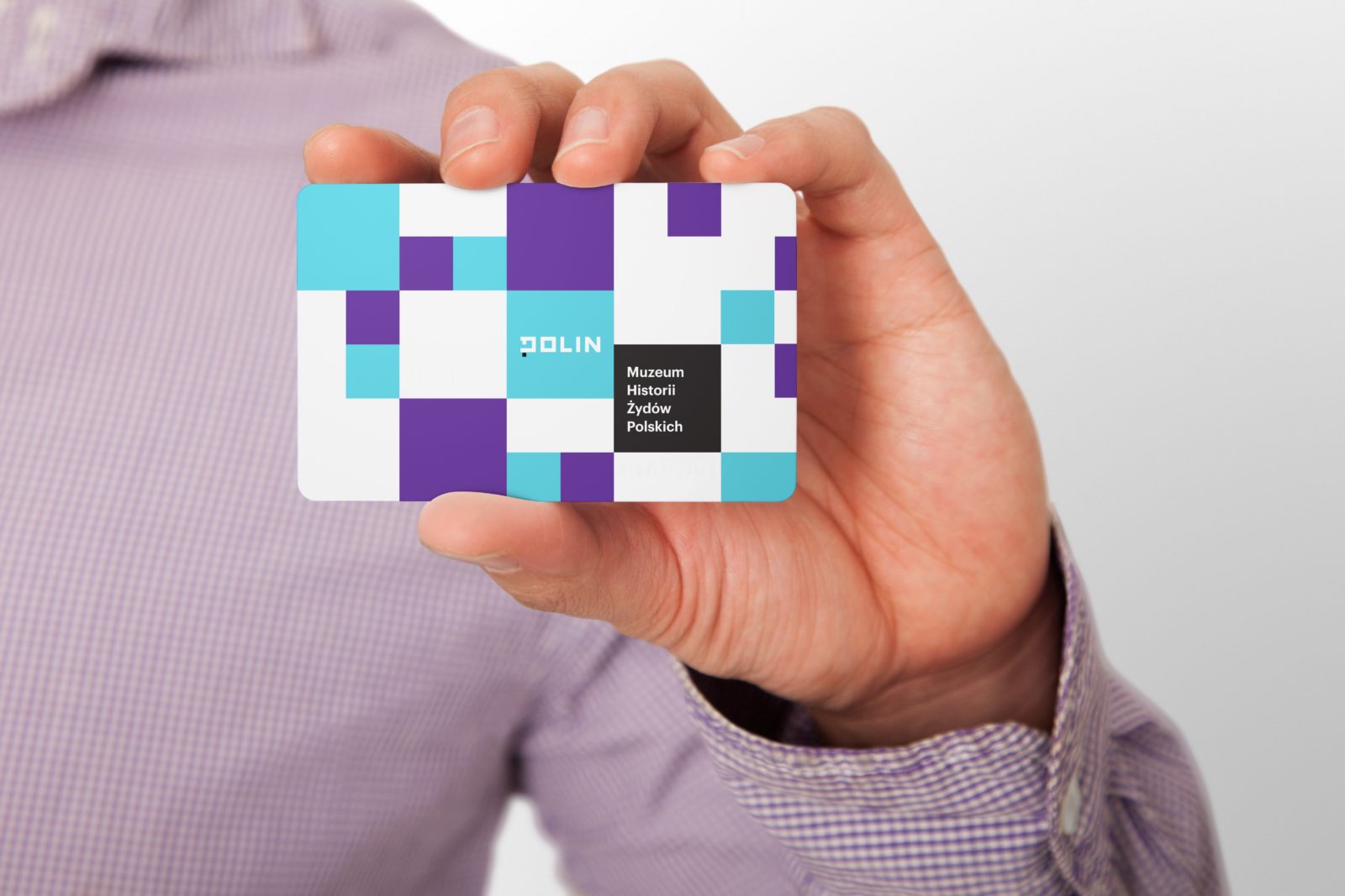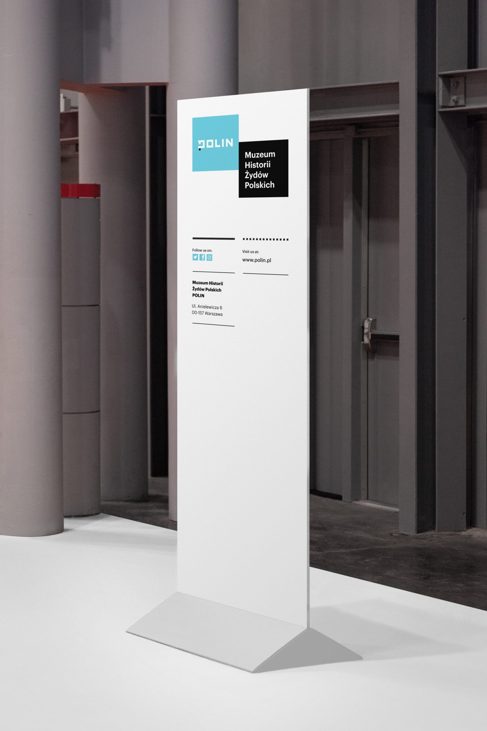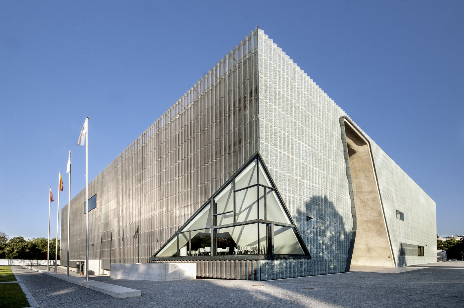
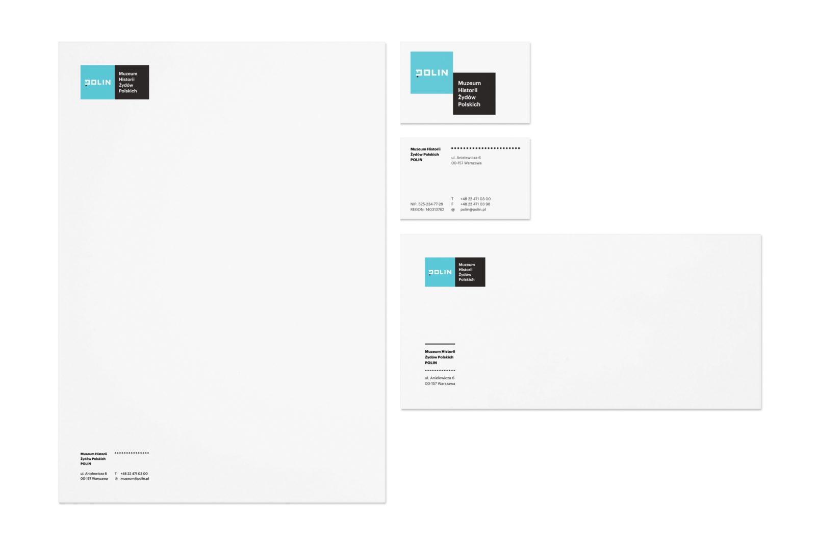
The system we created for the POLIN Museum is based on a logo created by the PZL agency. Inspired by the windows of the museum building, we extracted the square symbol, which became the foundation and precept for the new visual identity.
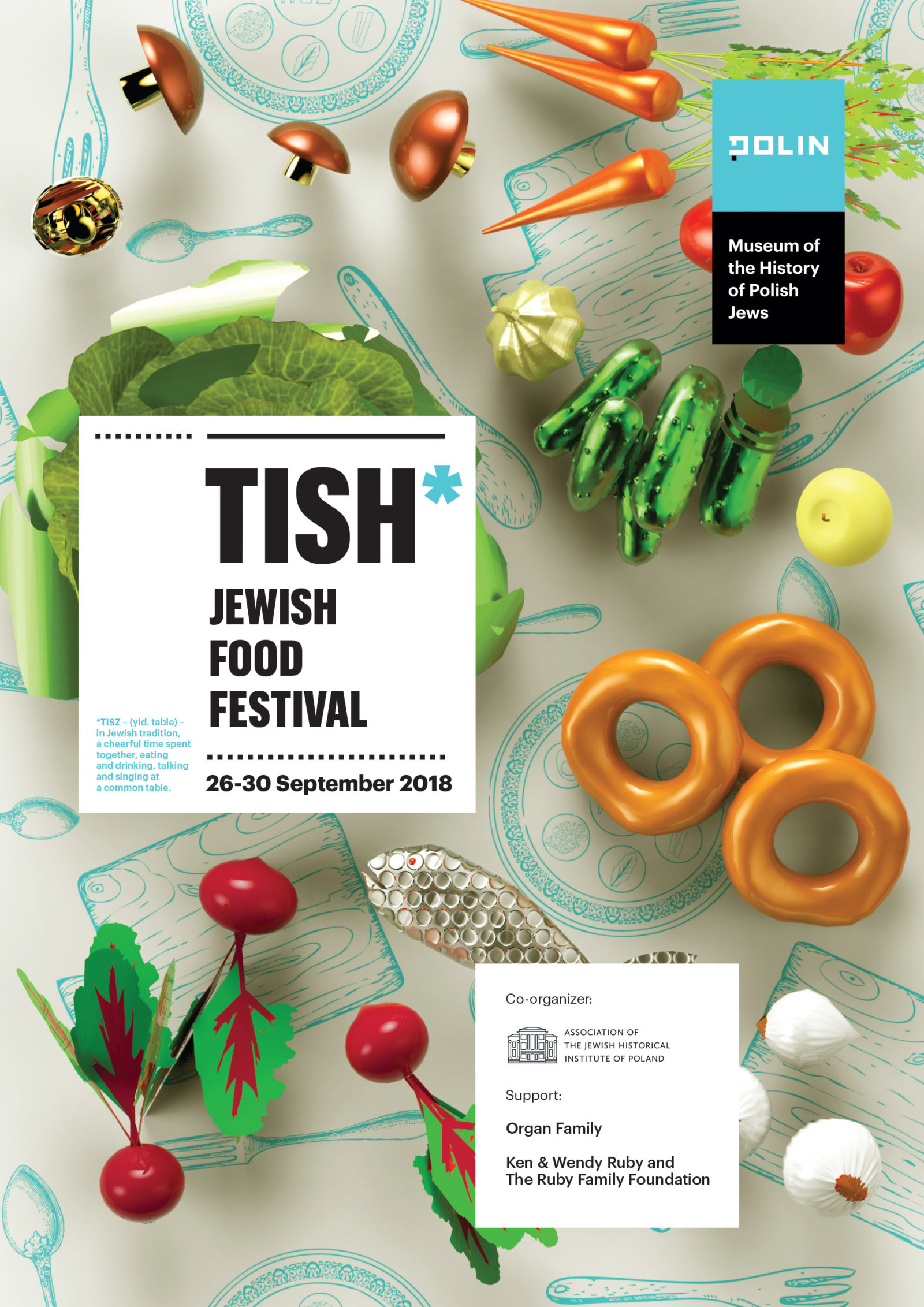
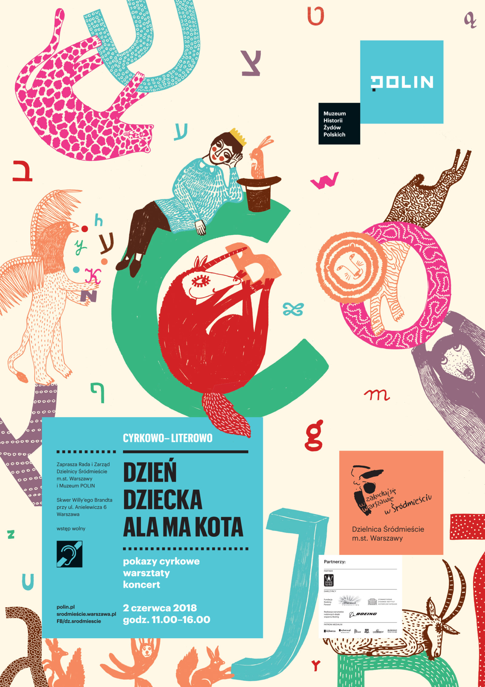
The problem identified by the client was related to visual inconsistency of communication by POLIN and its related initiatives. The branding ecosystem of the museum is a constellation of several brands – the POLIN itself, King Matt’s Family Education Area, Made in POLIN Festival, Museum on Wheels, and the Daffodils campaign. All these initiatives were to utilize one concise but distinctive system of communication. The goal of our rebranding was to create a modern, concise and functional visual system, encompassing various sub-brands and communication opportunities.

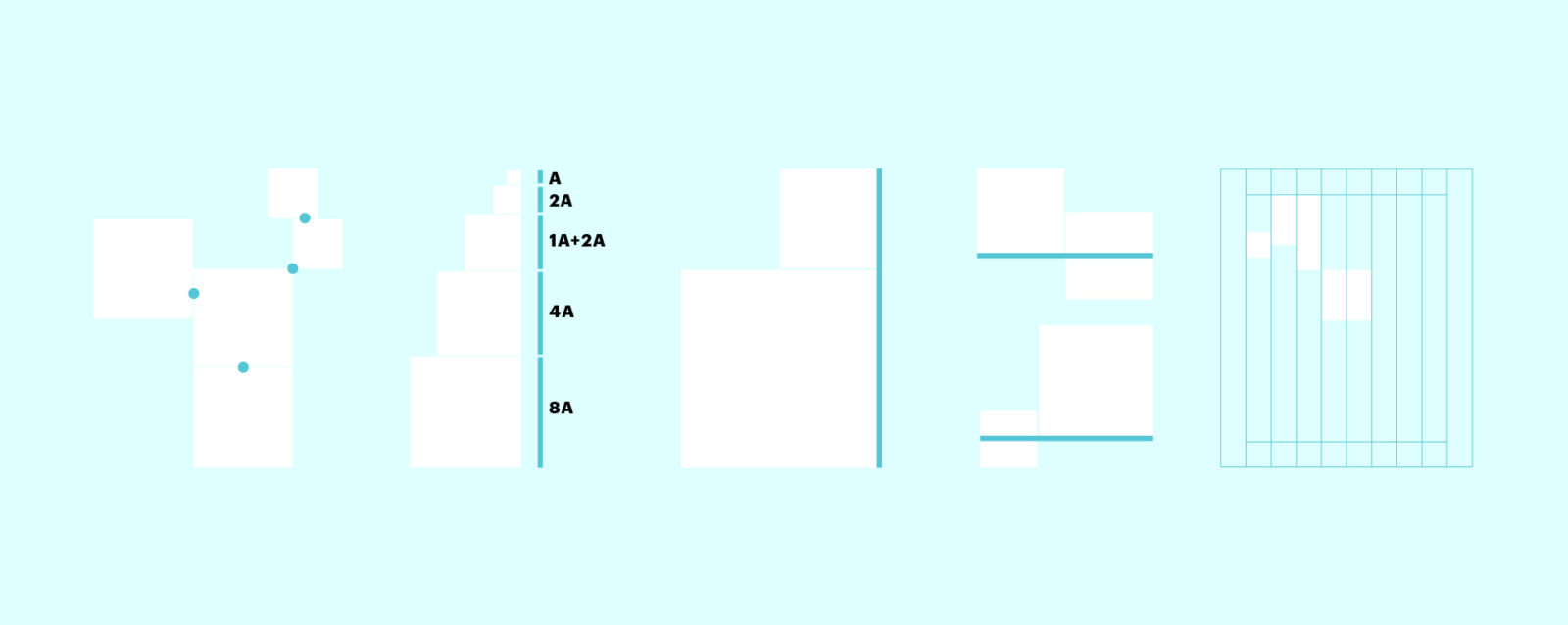
The brand manual gives a detailed description of the algorithm that governs how the squares combine into archipelagos – on posters, in guides, brochures, and any other printed publications. We planned exactly how the new visual system would translate to specific sub-brands.
After 10 weeks of intensive work, the rebranding has been presented during the Daffodils campaign. Research conducted by the IQS agency involved 6 posters and showed a high level of recognition of POLIN as the organizer of these events and exhibitions; it also confirmed that the new visual system contributes to retaining a proper hierarchy of communications.