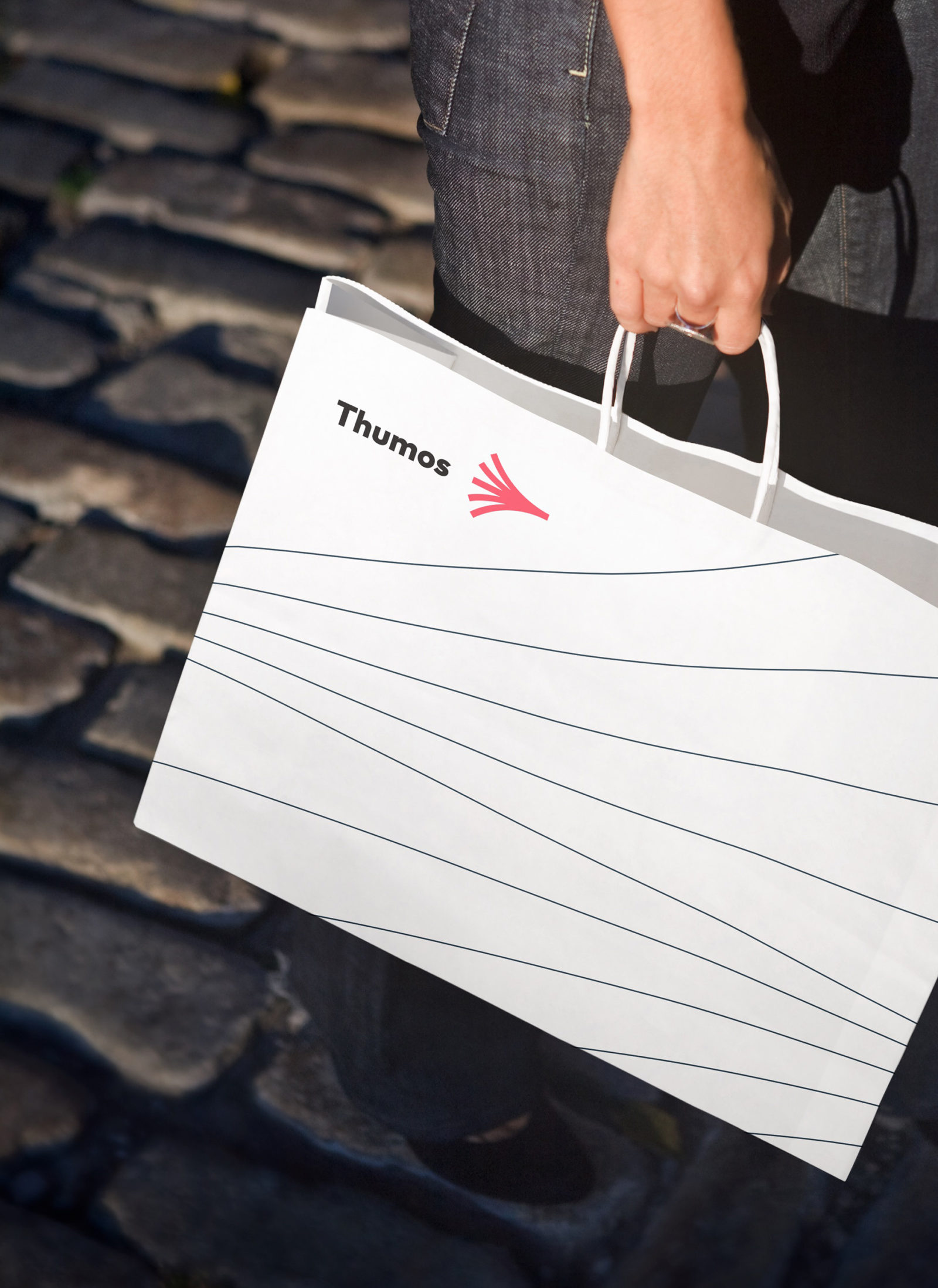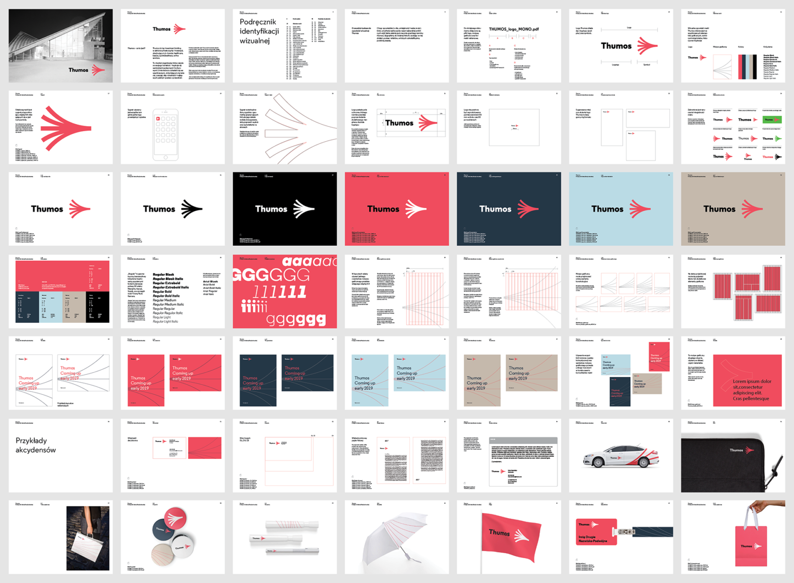
The Greek word thumos means strength, valor and determination that allows to turn a vision into action. This name and vision have been adapted by an investment holding – a group of enterprises working together in order to change the world for the better by implementing bold visions and new solutions.
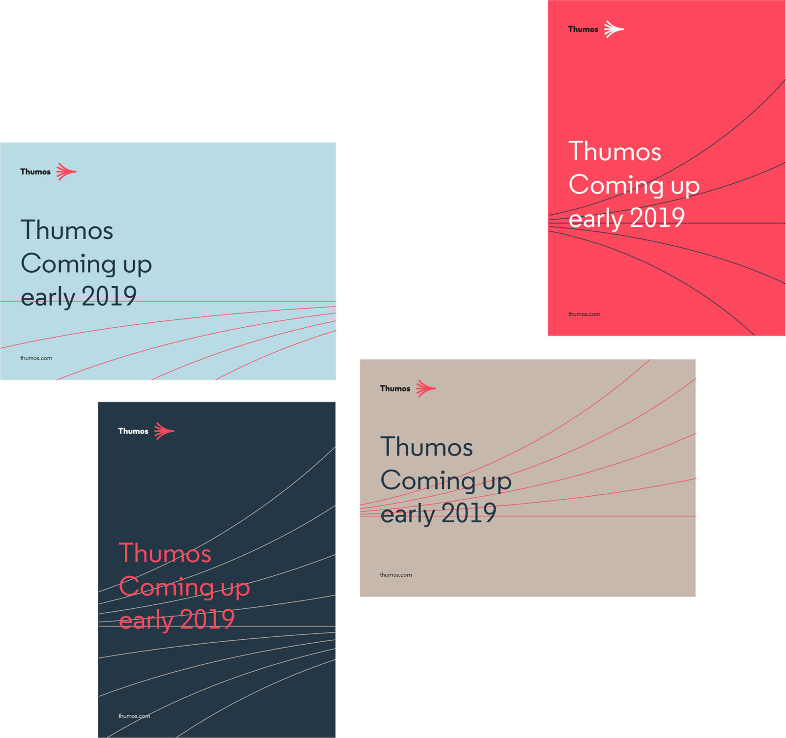
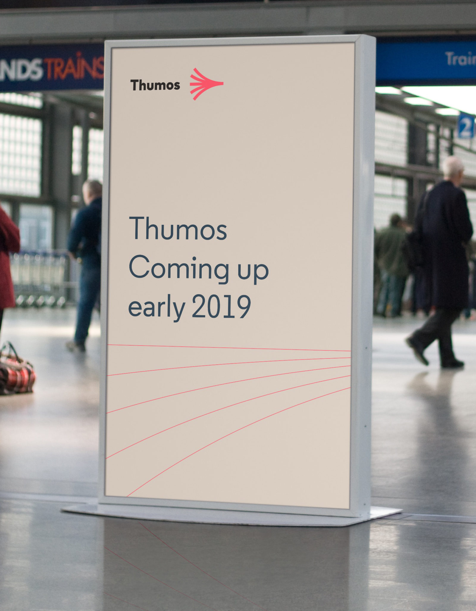
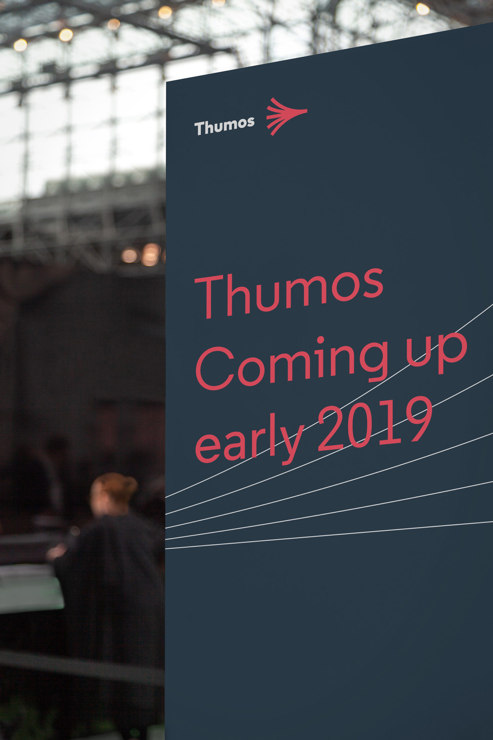
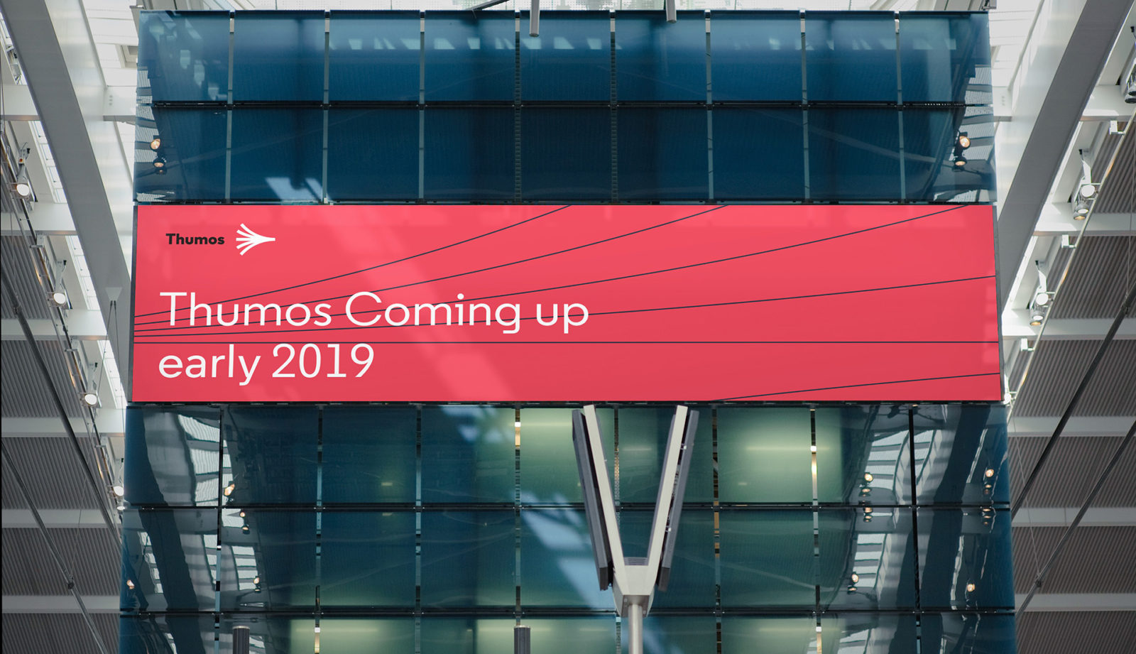
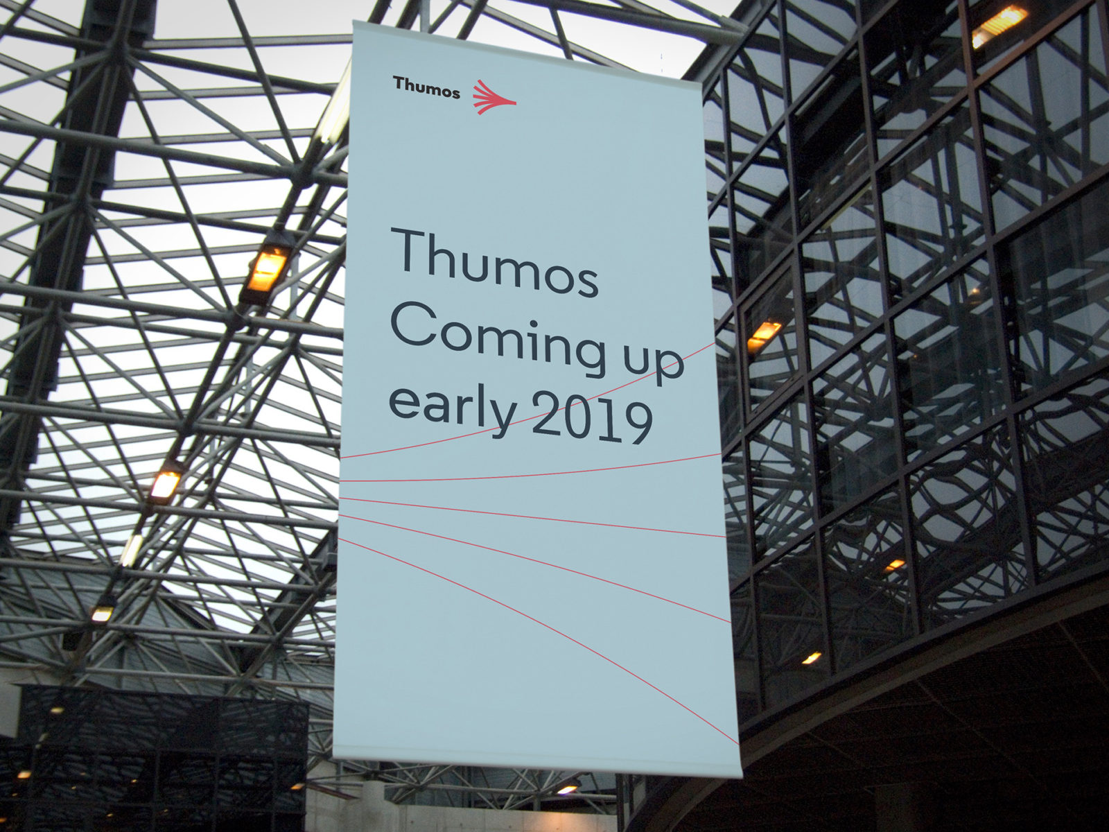
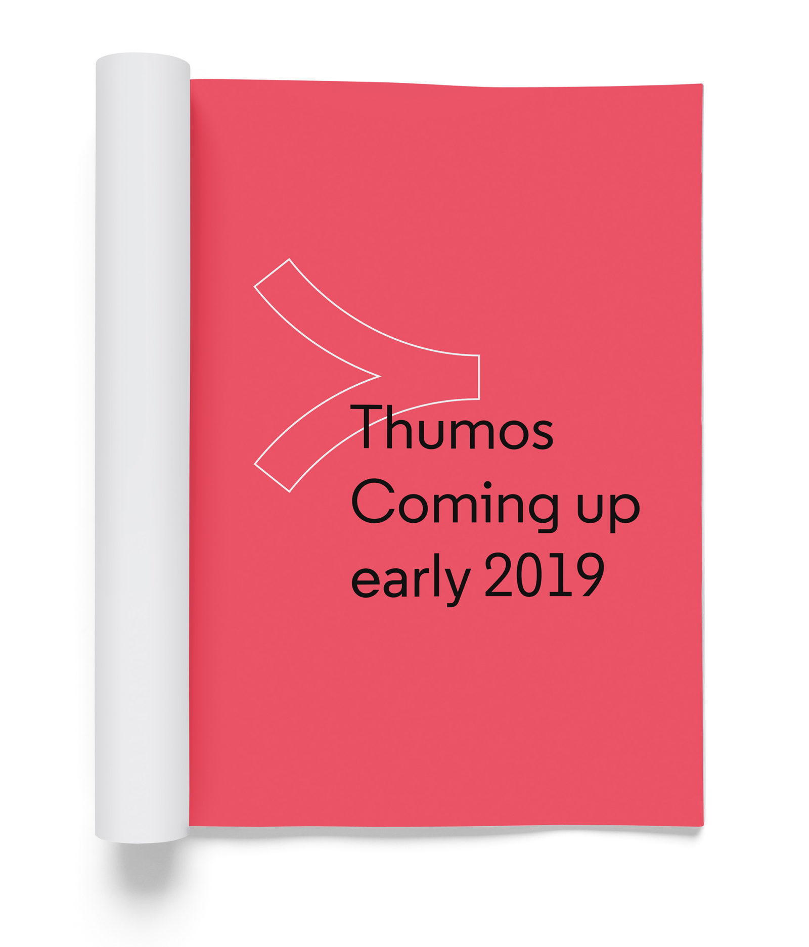
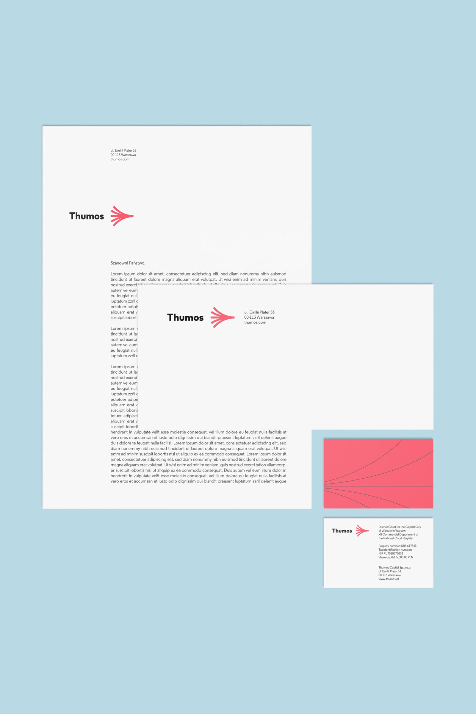
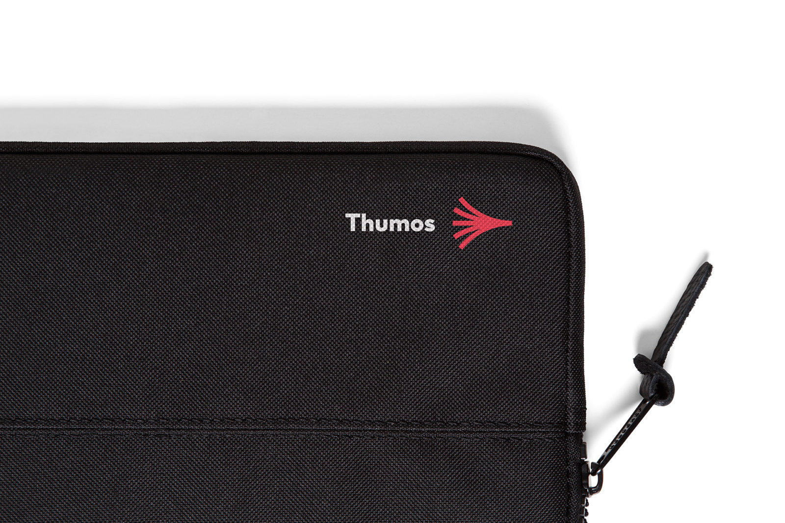
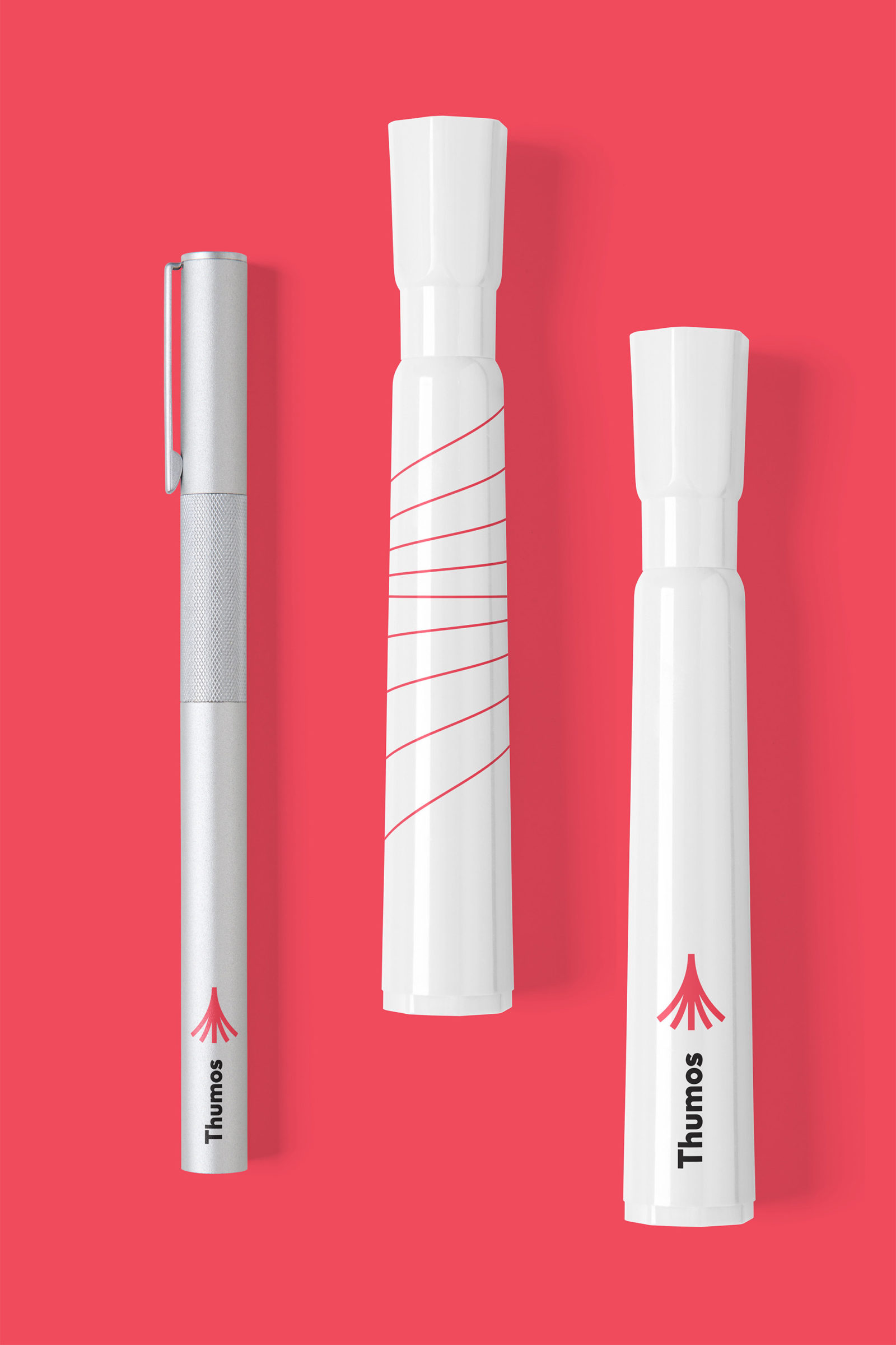
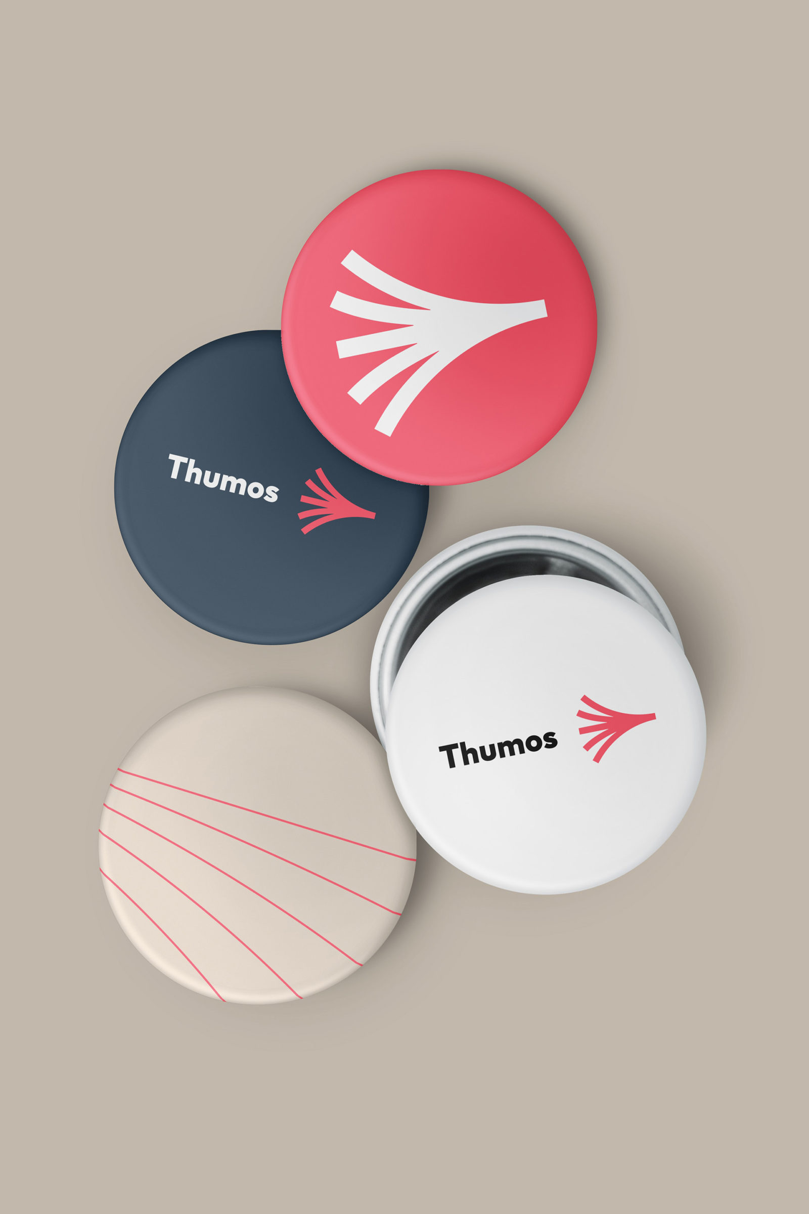
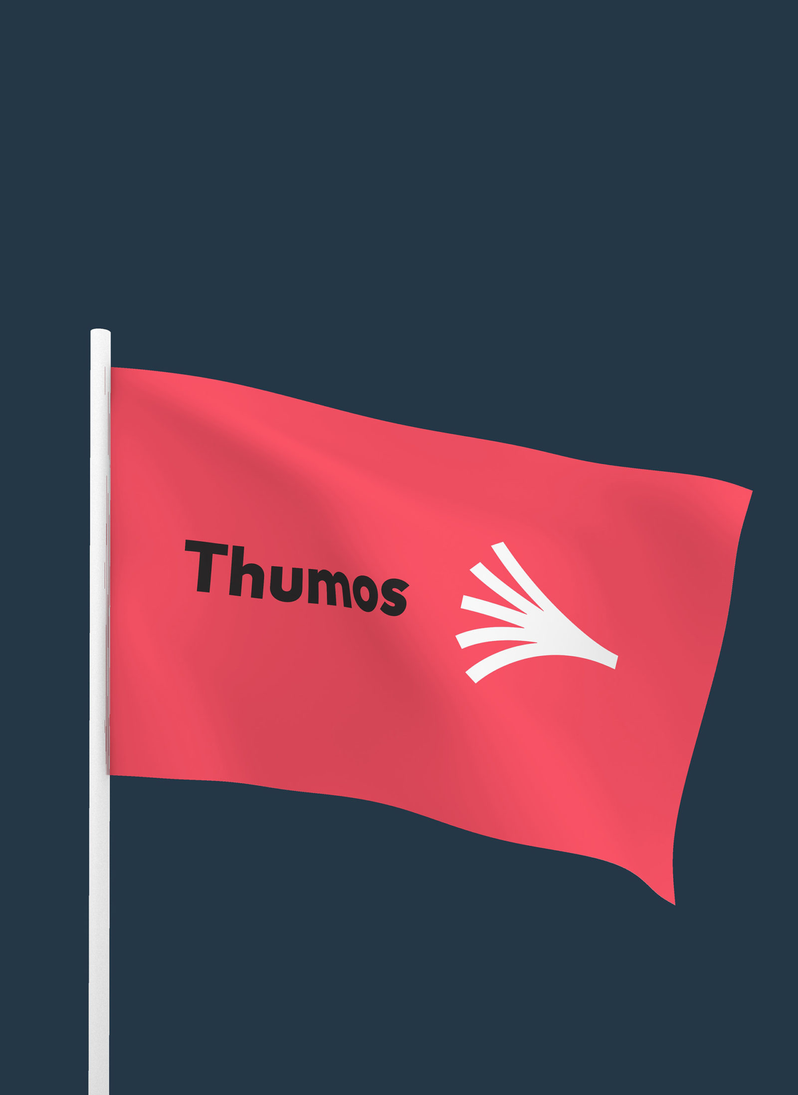
The symbol we created is a visual tale of creative tension, the sheer magnitude of possible solutions, and the determination in pursuing goals. The lines in the visual identification we proposed are manifested in two ways: as strong, brave arcs in the logo, and a thin line pattern in the background.
We sought inspiration in the most prominent chapters of history of design. While seeking a suitable color palette, based on the opposition of coldness and warmth, we turned to the Polish School of Posters; for the typeface, we used a font that is a contemporary homage to the lettering traditions of the 1930s and 1940s.
We sought inspiration in the most prominent chapters of history of design. While seeking a suitable color palette, based on the opposition of coldness and warmth, we turned to the Polish School of Posters; for the typeface, we used a font that is a contemporary homage to the lettering traditions of the 1930s and 1940s.